Objective To build a comprehensive visual identity for a sustainable apparel business specializing in upcycled, one of a kind garments repurposed from historic quilts and estate textiles. The branding needed to bridge the gap between old world Americana and the modern age.
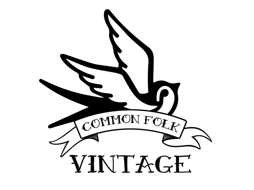
Strategy & Execution I partnered with the client to translate their passion for textile preservation into a scalable brand ecosystem. Our early design phases explored a variety of retro script formats and typography experiments inspired by mid-century aesthetics. Through a highly collaborative process, we ultimately selected the bold, symbolic style of classic American Traditional art as our central theme. I developed a flexible icon system featuring a custom sparrow motif alongside traditional serif lettering to honor the craft element of the hand sewn garments.
The Deliverables & Full Scope Integration To support the unique nature of wearable art, I delivered an open ended, highly adaptable brand package designed to shift with seasonal collections:
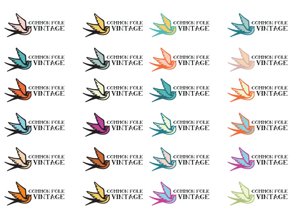
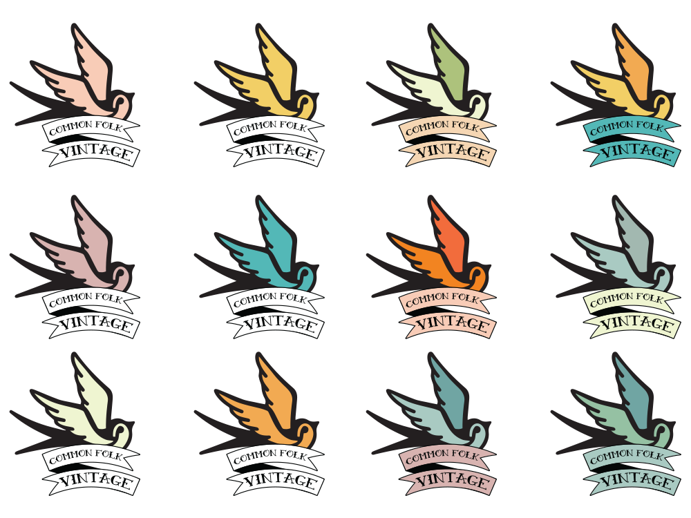
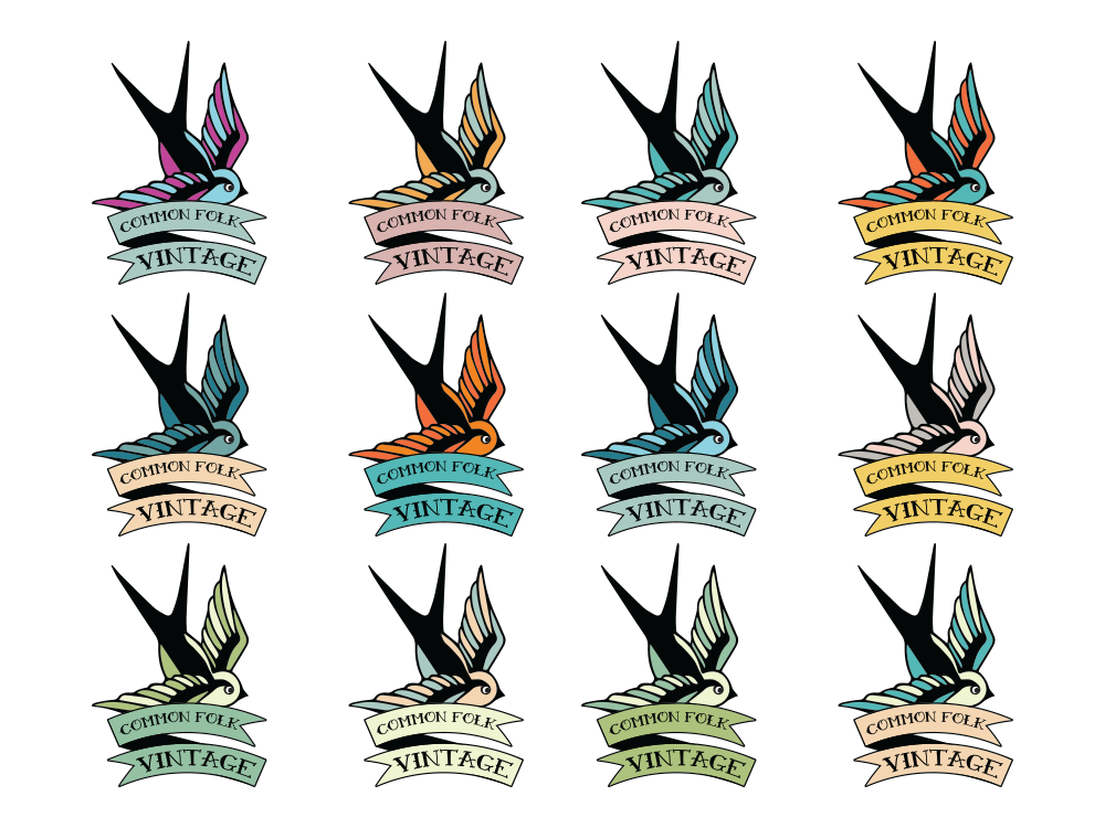
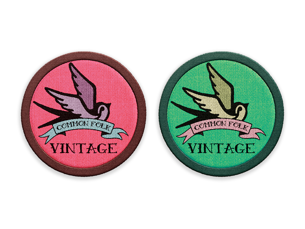
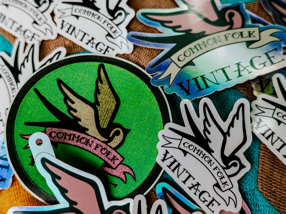
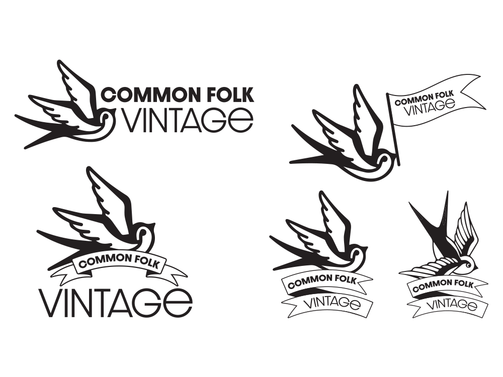
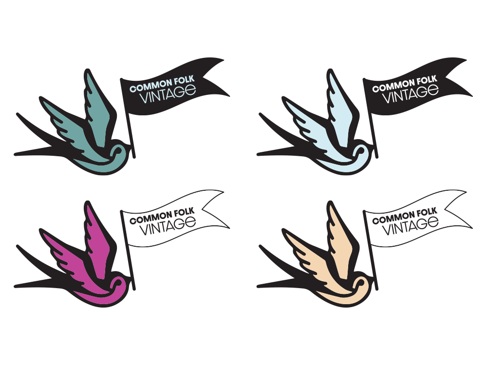
Comprehensive Logo Architecture: Created a primary brand mark, diverse secondary logos, and a wide array of colorway options to give the client total freedom when matching individual fabric prints.
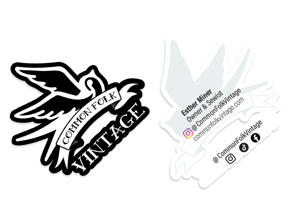
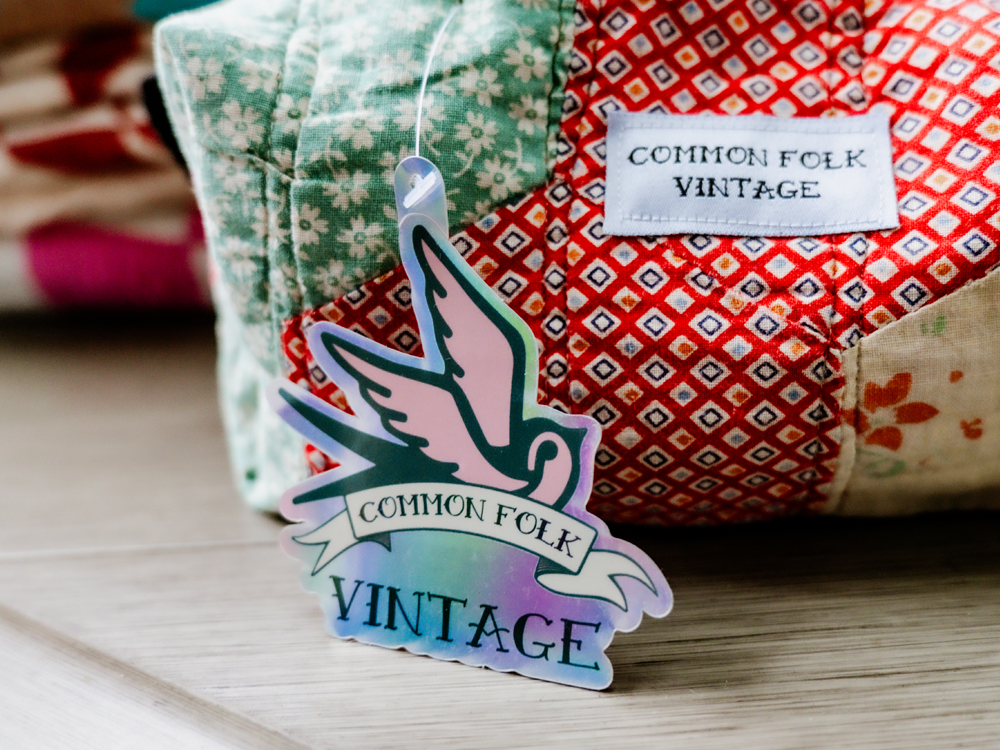
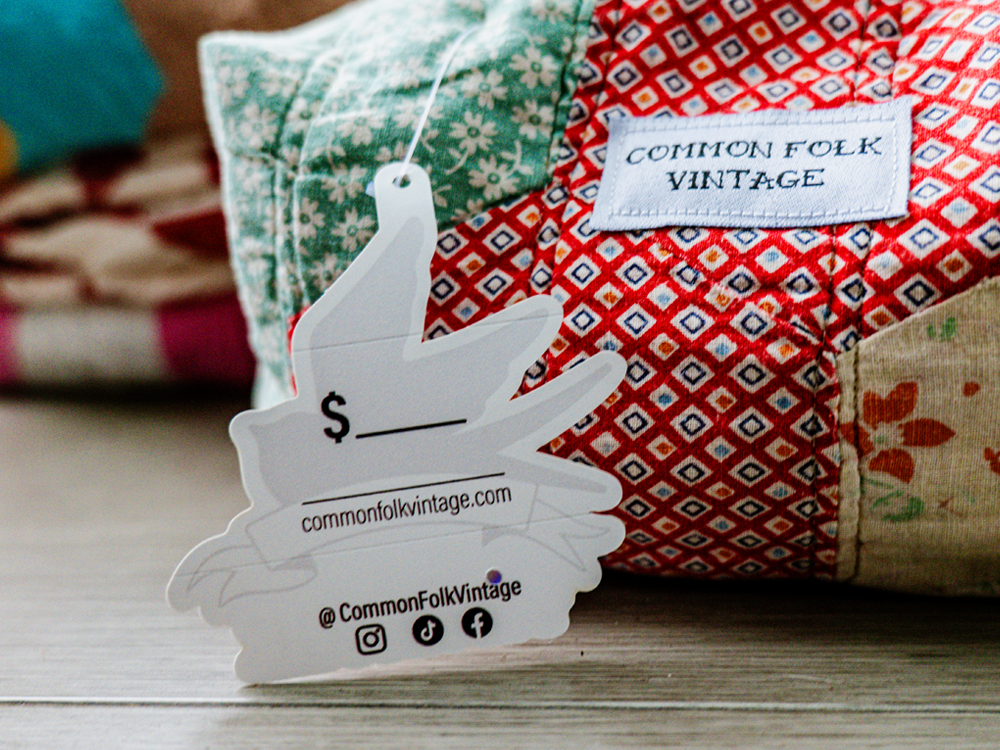
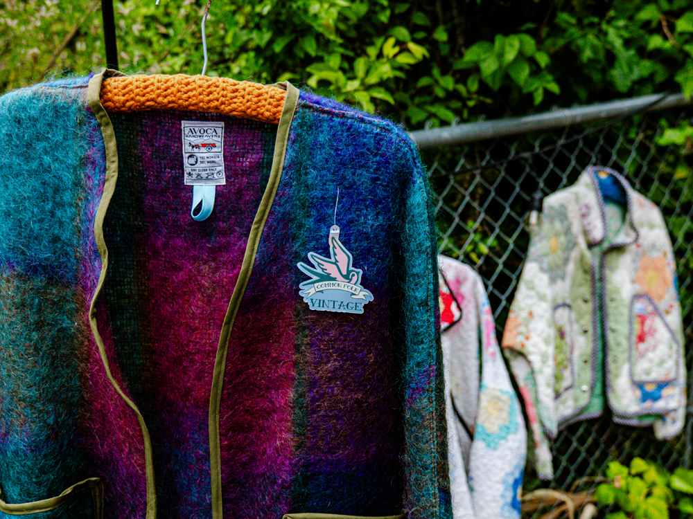
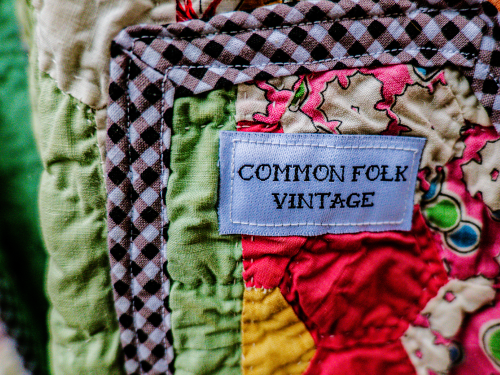
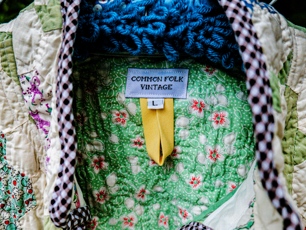
Apparel Production & Packaging: Designed custom woven neck labels, embroidered patches, and holographic hang tags. This ensured the brand identity translated flawlessly from digital vectors into physical apparel manufacturing, creating an elevated, tactile experience for the consumer.
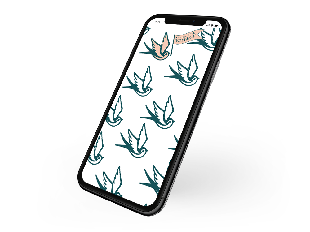
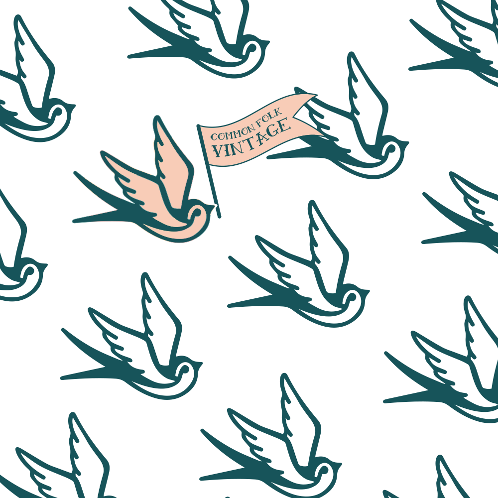
Scalable Brand Systems: Supplied repeating seamless patterns and versatile line work illustrations intended to be utilized across both digital platforms and physical packaging elements on an as needed basis.
Give the brand wings
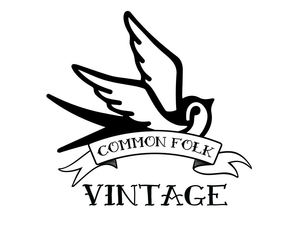
To retain authenticity, ultimately we left the final design & color palette open ended and versatile. A nod to the process of letting the textile tell you what it wants to become. Although the final primary logo, pictured above, was a strong visual representation of the brand ideals, I supplied several solutions for logos, intended to be used on an ‘as seen fit’ basis.
Additionally a broad range of color palette options were supplied, leaving the branding open to catalogue specific collections or the ability to change with the seasons. The final visual identity leaves flexibility and freedom for the brand to represent themselves on their own terms, similar to the artistic freedom when repurposing textile to create a new and unique work of art.